Visual Style: Branding, Characters, & Setting

The visual style of the module was designed to feel connected to the school setting used throughout the experience. The primary color palette was built around the school’s blue and gold branding, with softer accent colors derived from those tones to keep the interface cohesive and easy to look at over time. Using the school colors helped the module feel more believable and grounded in these teacher’s specific educational environment rather than looking like a generic training course.
Branding

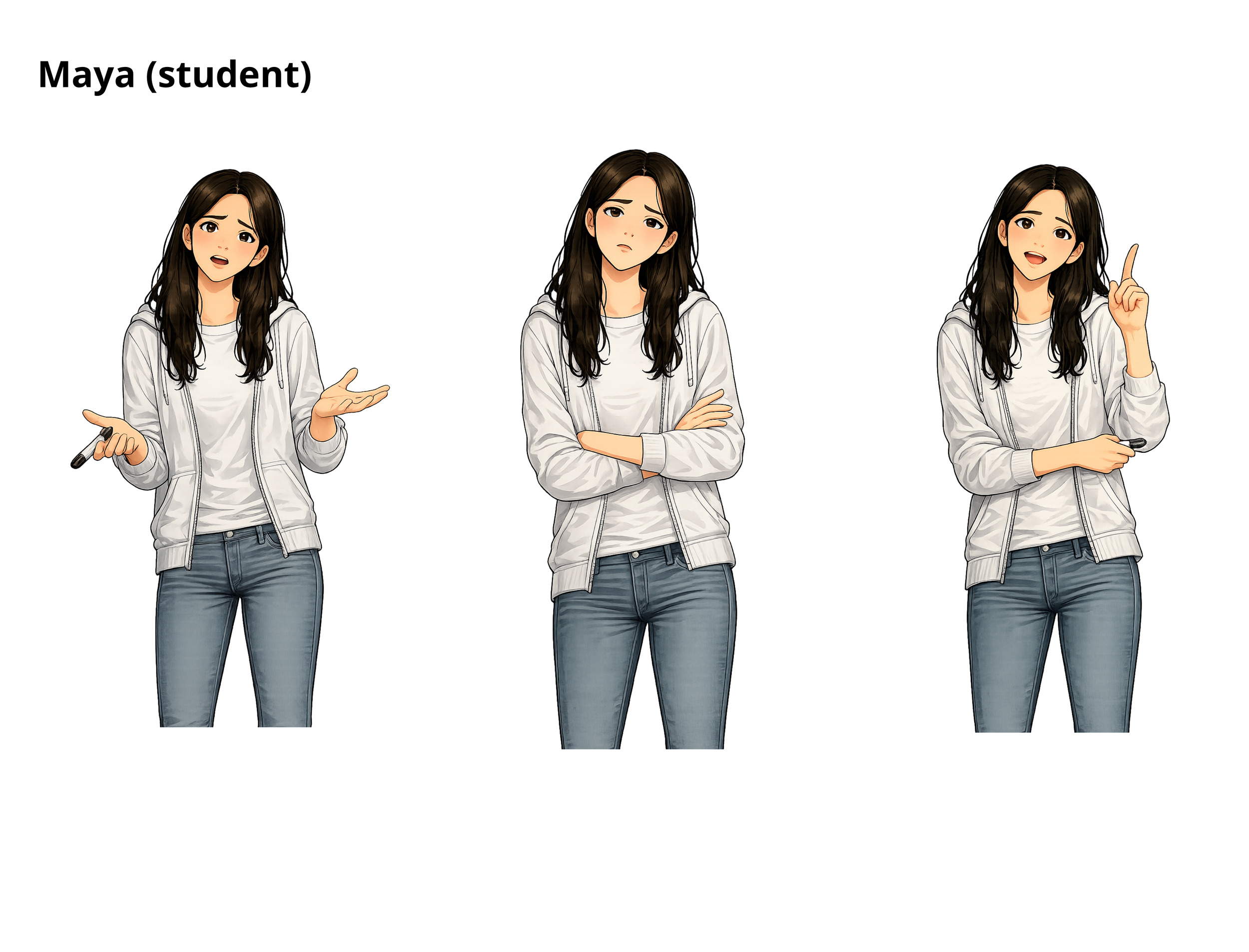
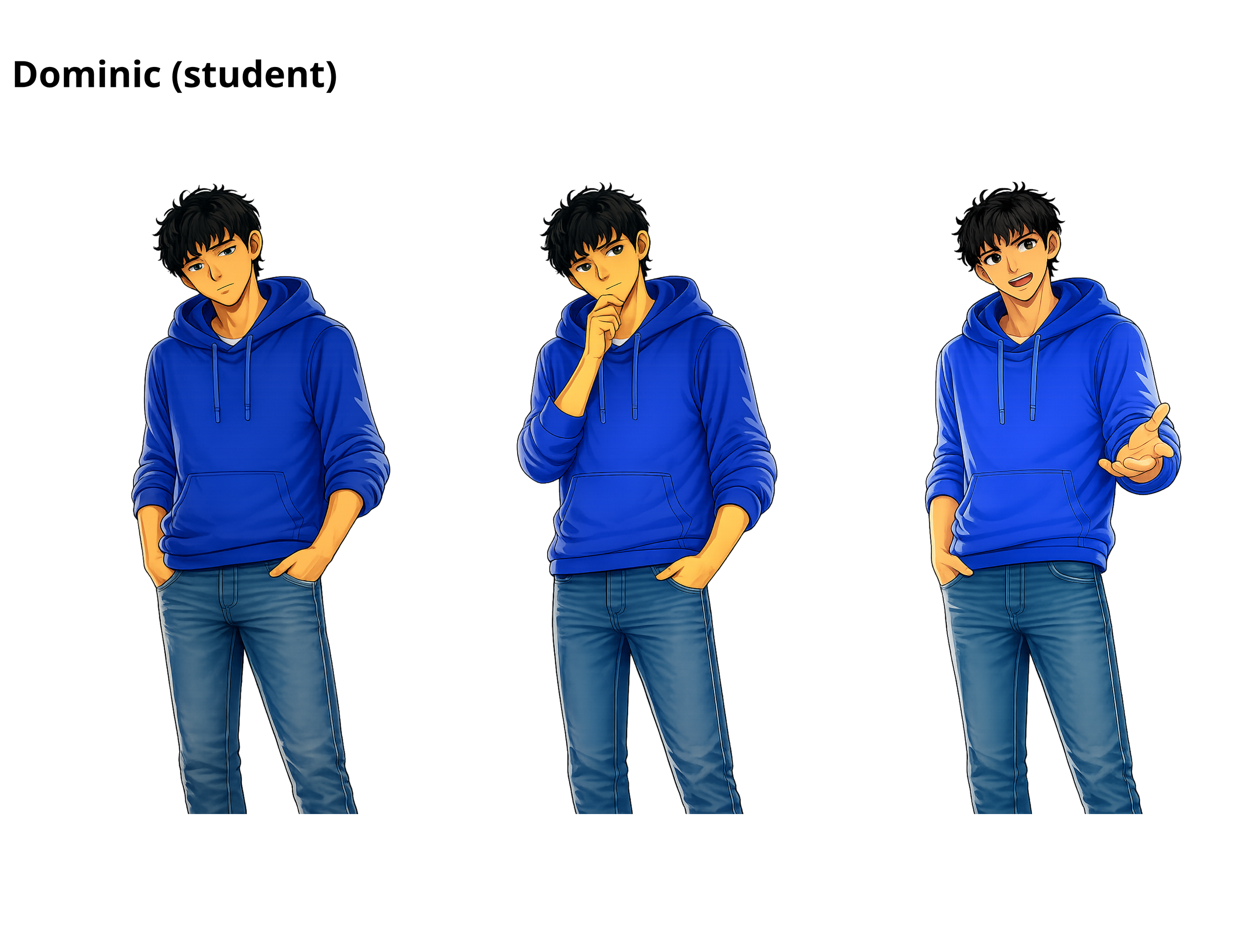
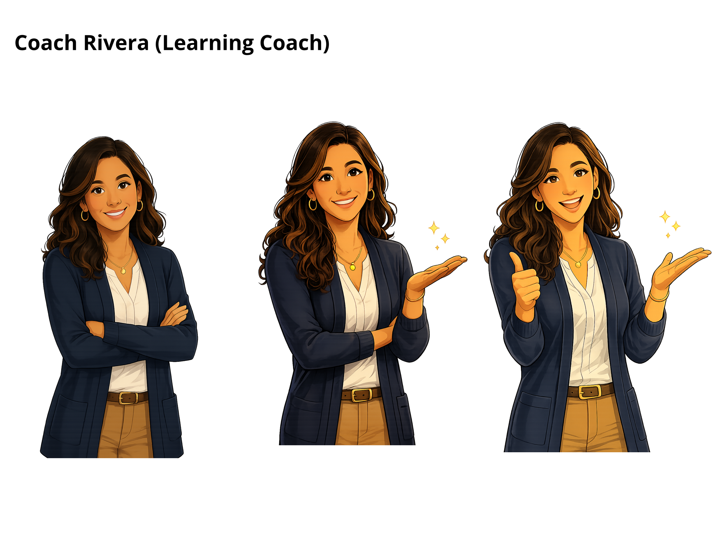
The module relied heavily on realistic interactions and conversations, so having recognizable characters became an important part of the experience. While experimenting with possible character styles in ChatGPT, three core characters emerged organically: Maya, Dominic, and Coach Rivera. Once those designs were established, the same visual style was carried throughout the project to maintain consistency and familiarity. Additional character poses and emotional expressions were then created to match different moments in the simulation pathways, allowing the conversations to feel more responsive and human rather than static.
Characters
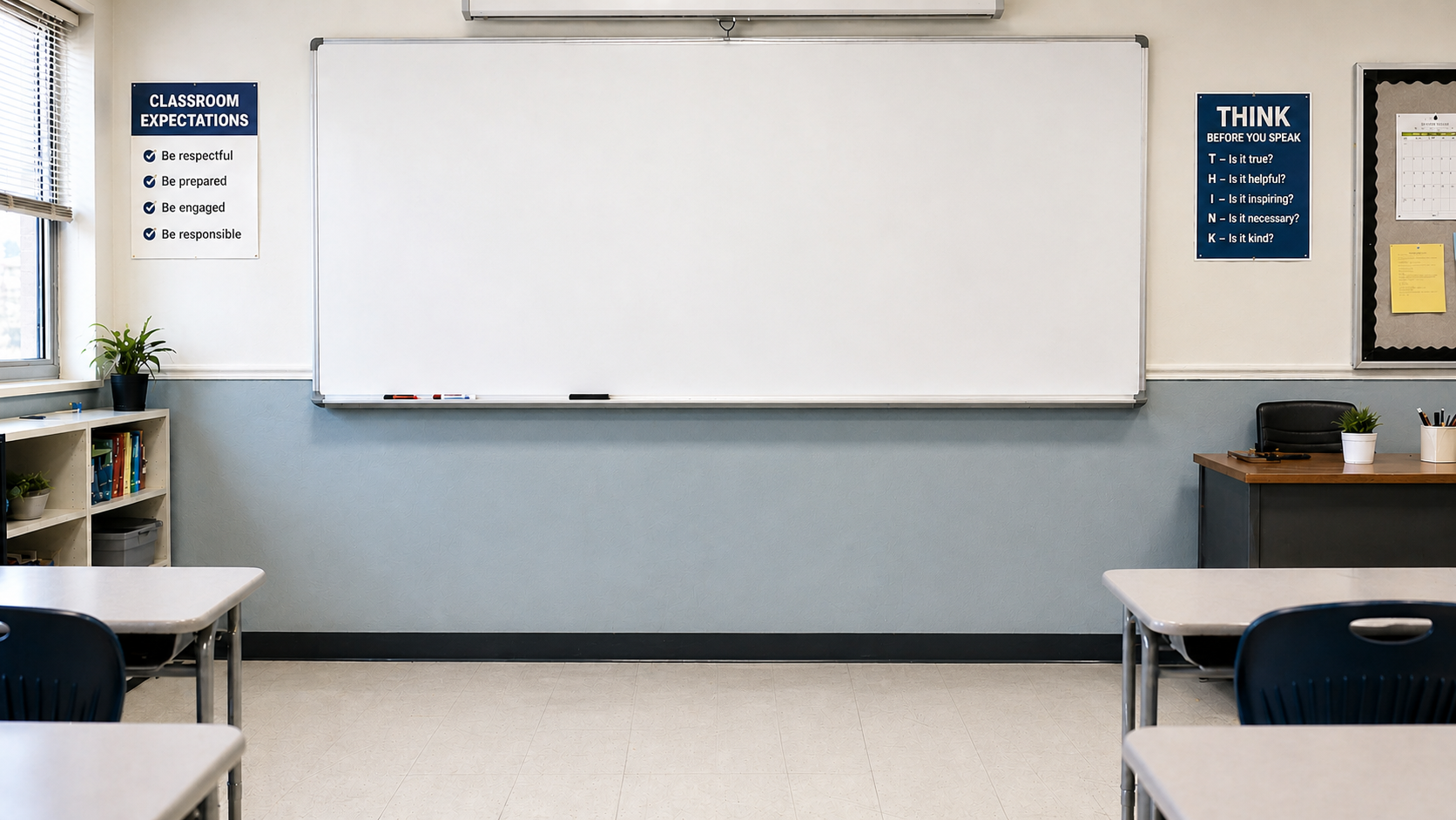
Because the training centered around inquiry-based learning and student thinking behaviors, the classroom environment also needed to reflect that instructional style. Most of the scenes were designed around visible whiteboards and collaborative classroom spaces inspired by the “Building Thinking Classrooms” model, where students work in groups while standing and problem solving together. The whiteboards became a recurring visual anchor throughout the module because they reinforced the idea that students were actively engaged in thinking and discussion rather than passively receiving information.
Setting